Print Design
As part of my role at Halton Healthcare, I designed various print materials that communicated key messages to patients, staff, and the community.
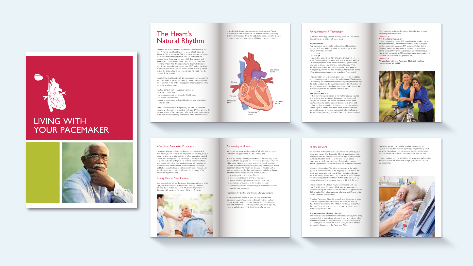
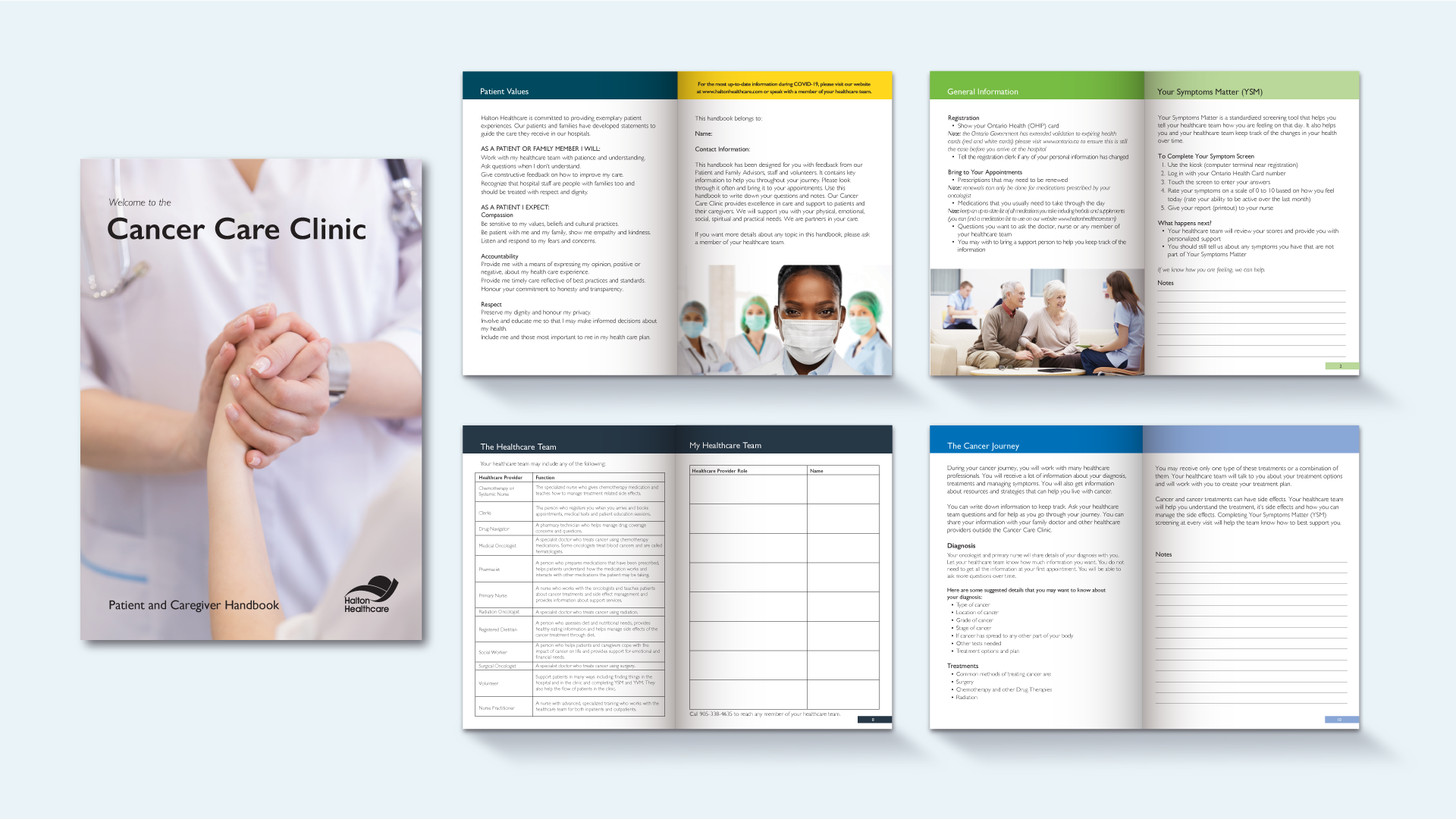
This included informative brochures, patient manuals, flyers, and posters for events and services.
Each design was tailored to the specific audience, ensuring clarity, accessibility, and alignment with the organization's branding guidelines.
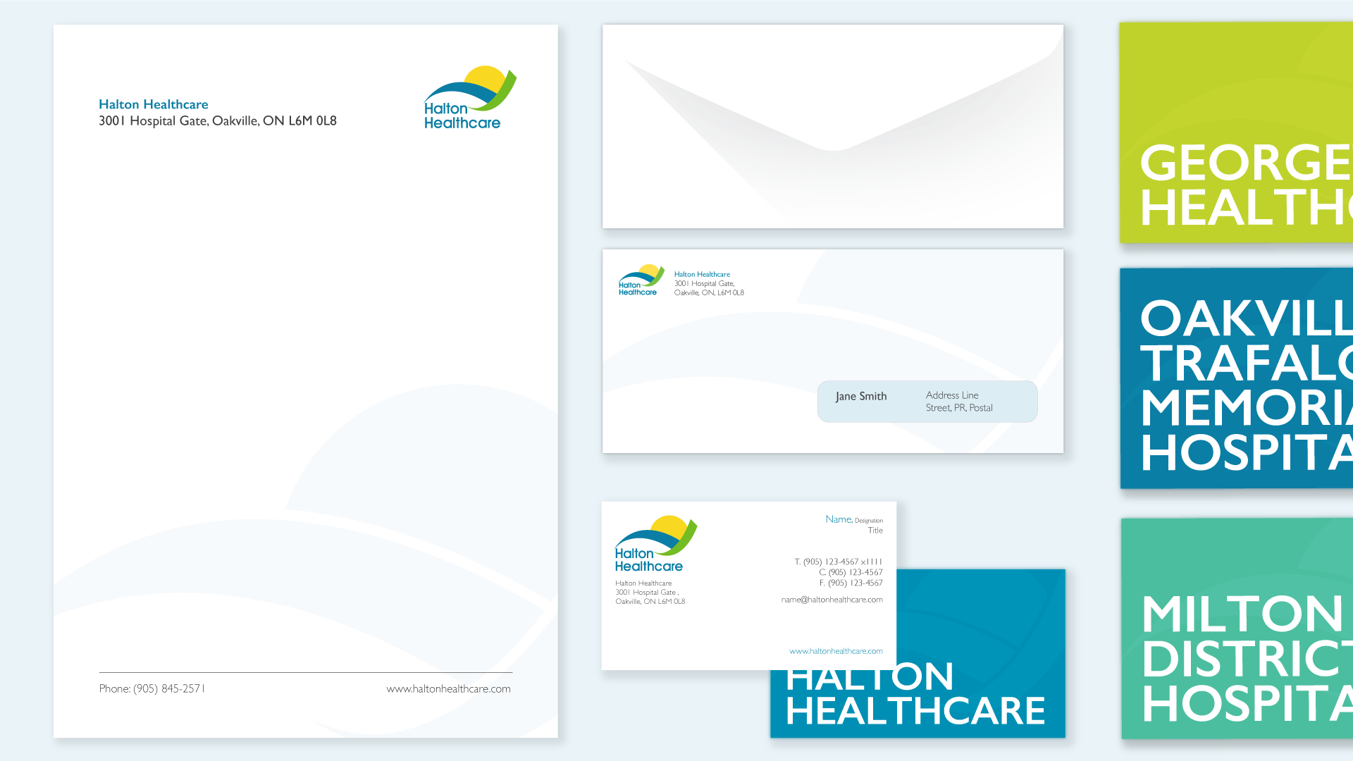
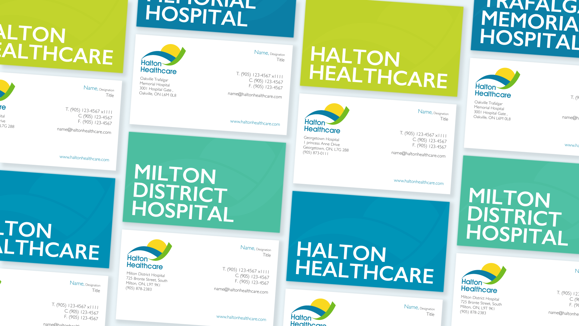
Print Examples
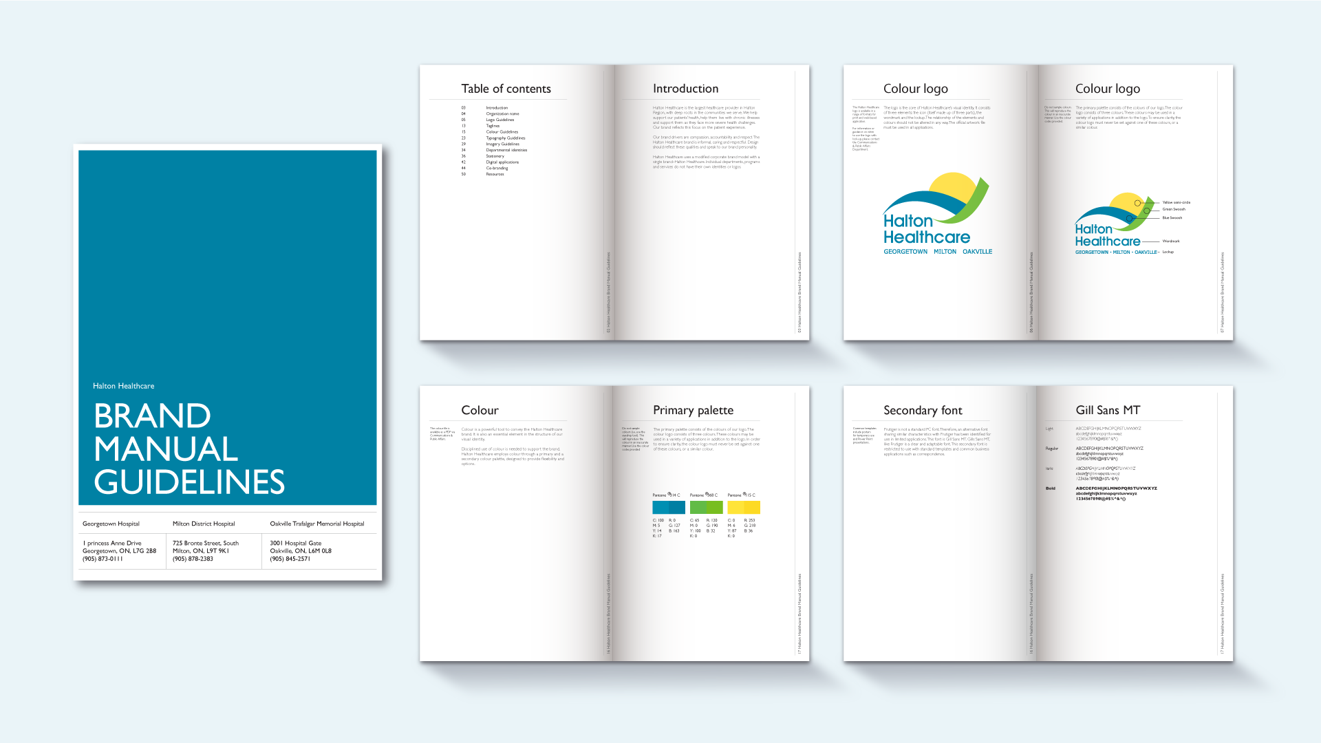
Here are some examples of print layout projects, including the brand manual guidelines, which help instruct how to apply the brand appropriately in different applications.
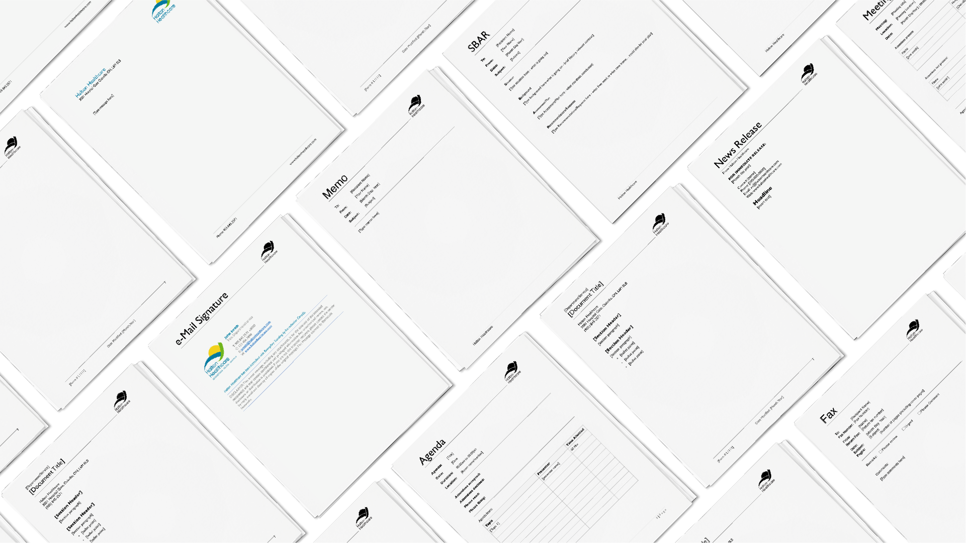
Internal Communications Templates
Creating internal templates helps staff input content easy in a unified manner, maintaining consistency and cohesion in documents.
Digital Design
I developed a range of digital collateral to enhance the organization's online presence and support communication efforts.
This included designing website assets such as banners, icons, and social media images, all created with user experience in mind.
My designs adhered to the healthcare industry's standards for accessibility, ensuring that they were easily navigable for all users while promoting the healthcare brand effectively across digital platforms.
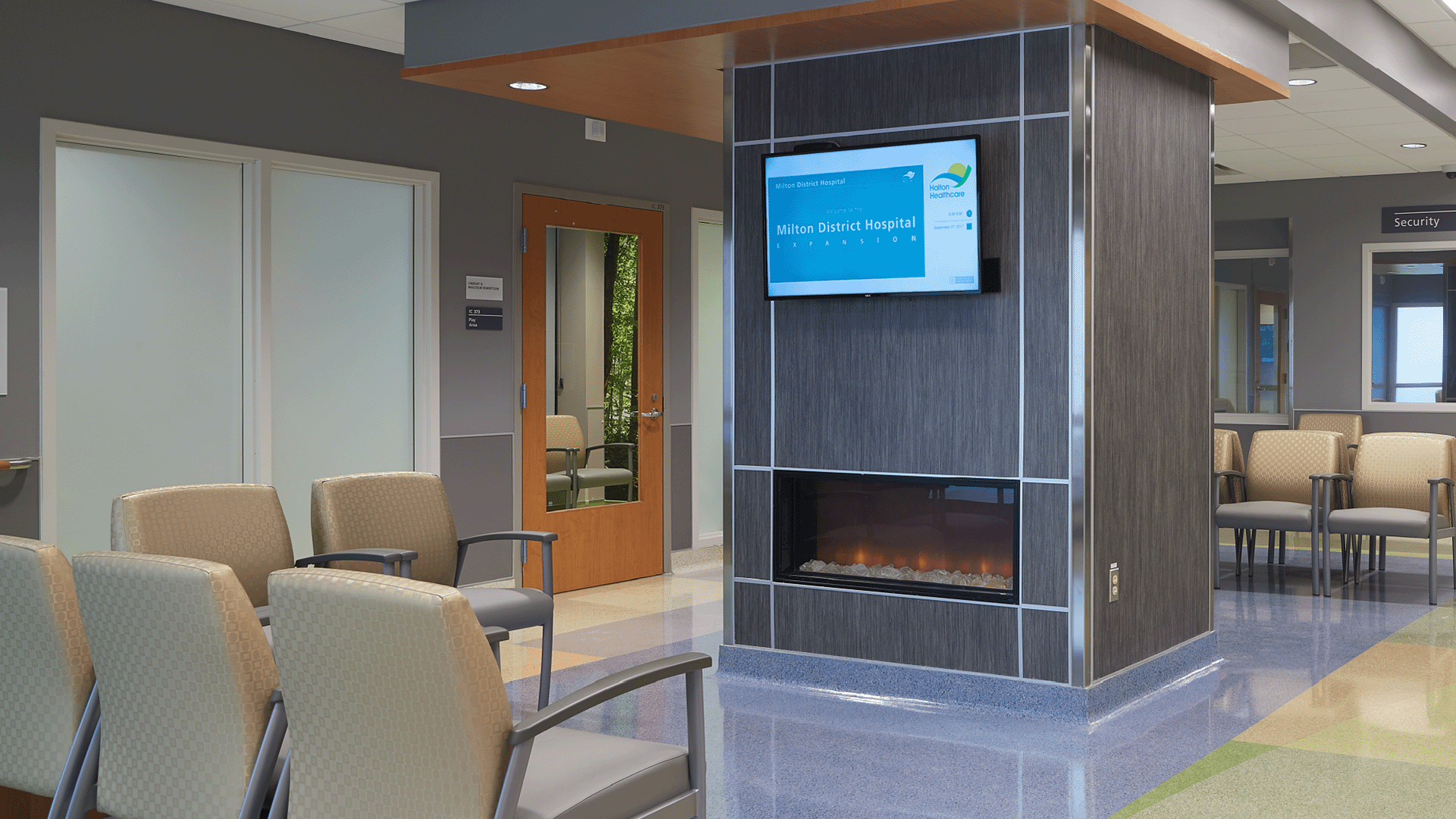
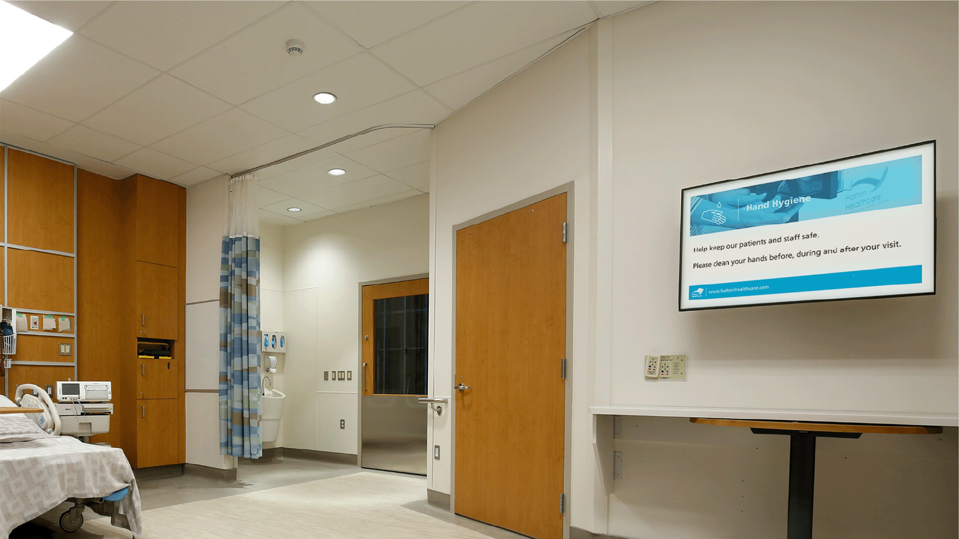
Digital Examples
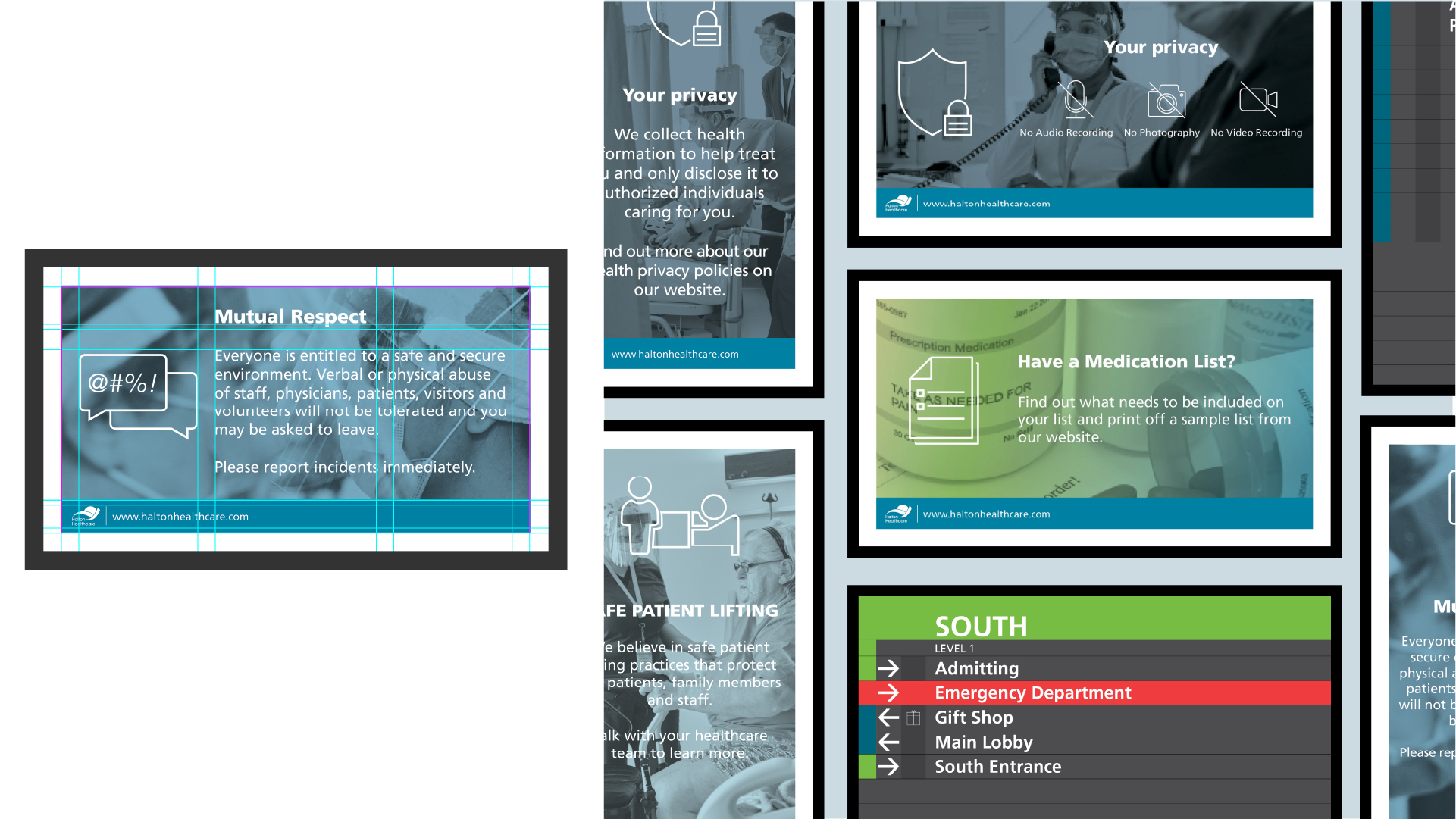
The digital monitors help to better inform patients, visitors and staff about corporate communications, hospital-related promotions and messaging, wayfinding and advertising (in specific areas).
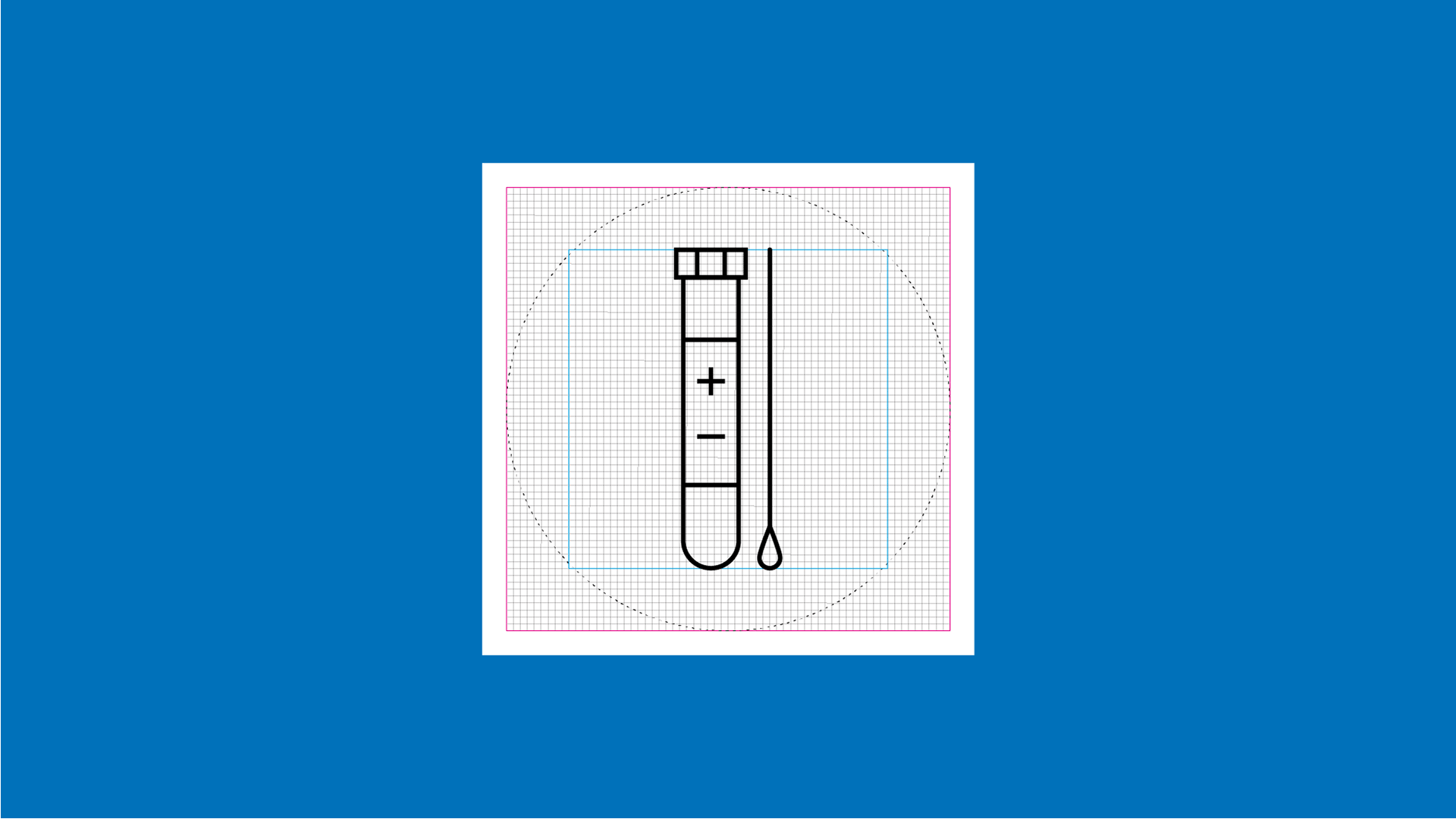
Iconography
The icons convey the theme or concept at a glance, making them easily understandable for most patients, visitors, staff, and the broader community. They include 160+ icons representing 12+ departments and services.
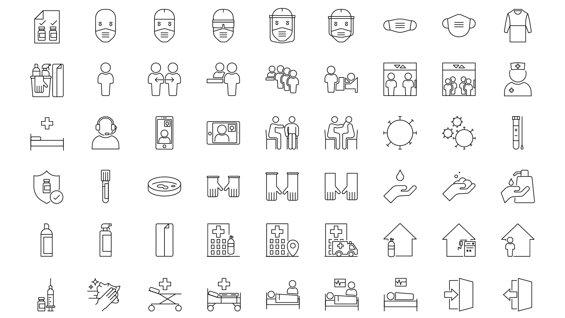
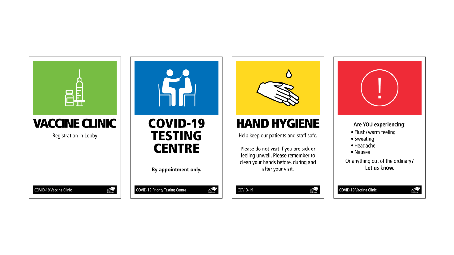
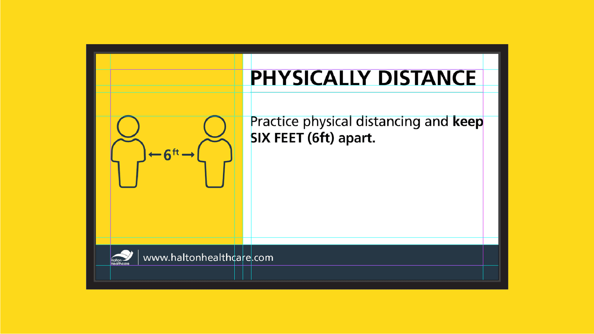
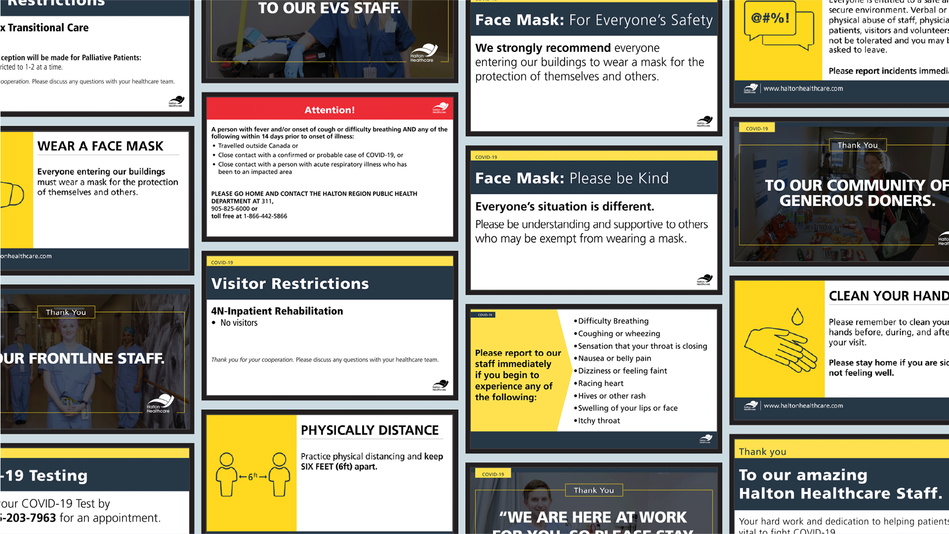
Covid-19
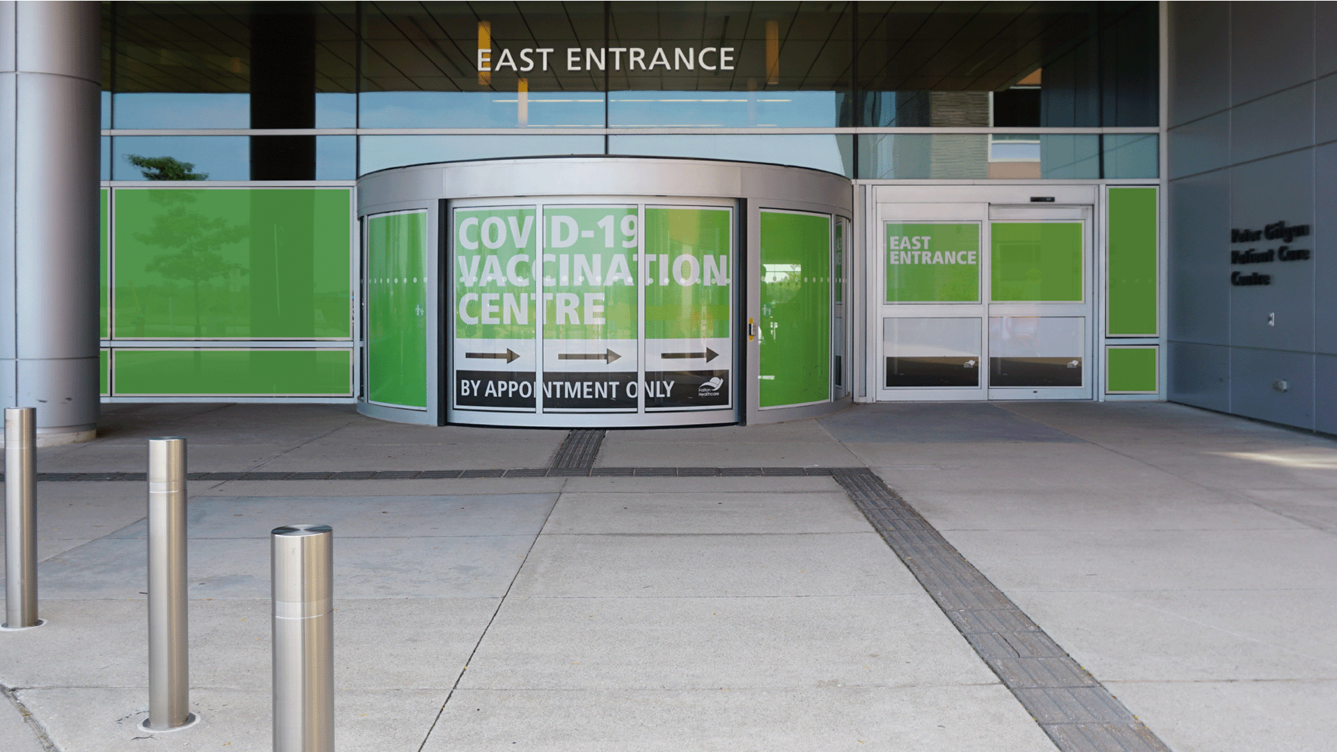
With the unprecedented nature of COVID-19, there was a lot of iterative design to distinguish and align collateral to the corporate brand. What made the situation unique was creating collateral quickly and often without much research, leading to constant iteration. By limiting colour and imagery, we made it easier to differentiate COVID-19 collateral from the corporate brand, all while incorporating elements from the brand.
Iconography
The icons quickly convey the theme or idea, making them easily understandable for patients, visitors, staff, and the broader community. This set includes dozens of icons.
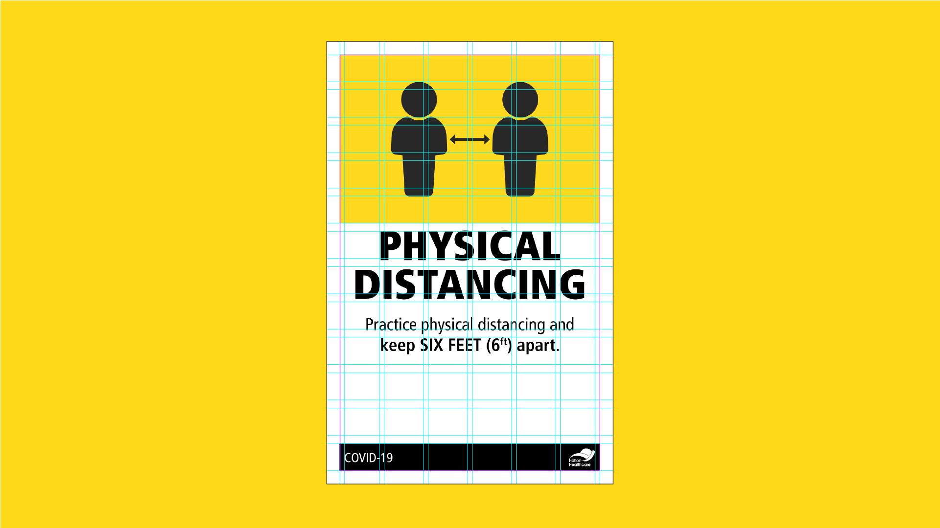
Modular Print Grid
Utilizing a modular grid helped assimilate the content (text and icons) of the posters in an efficient, orderly and simplistic way. The spatial divisions allow the pieces to work with long and short texts.
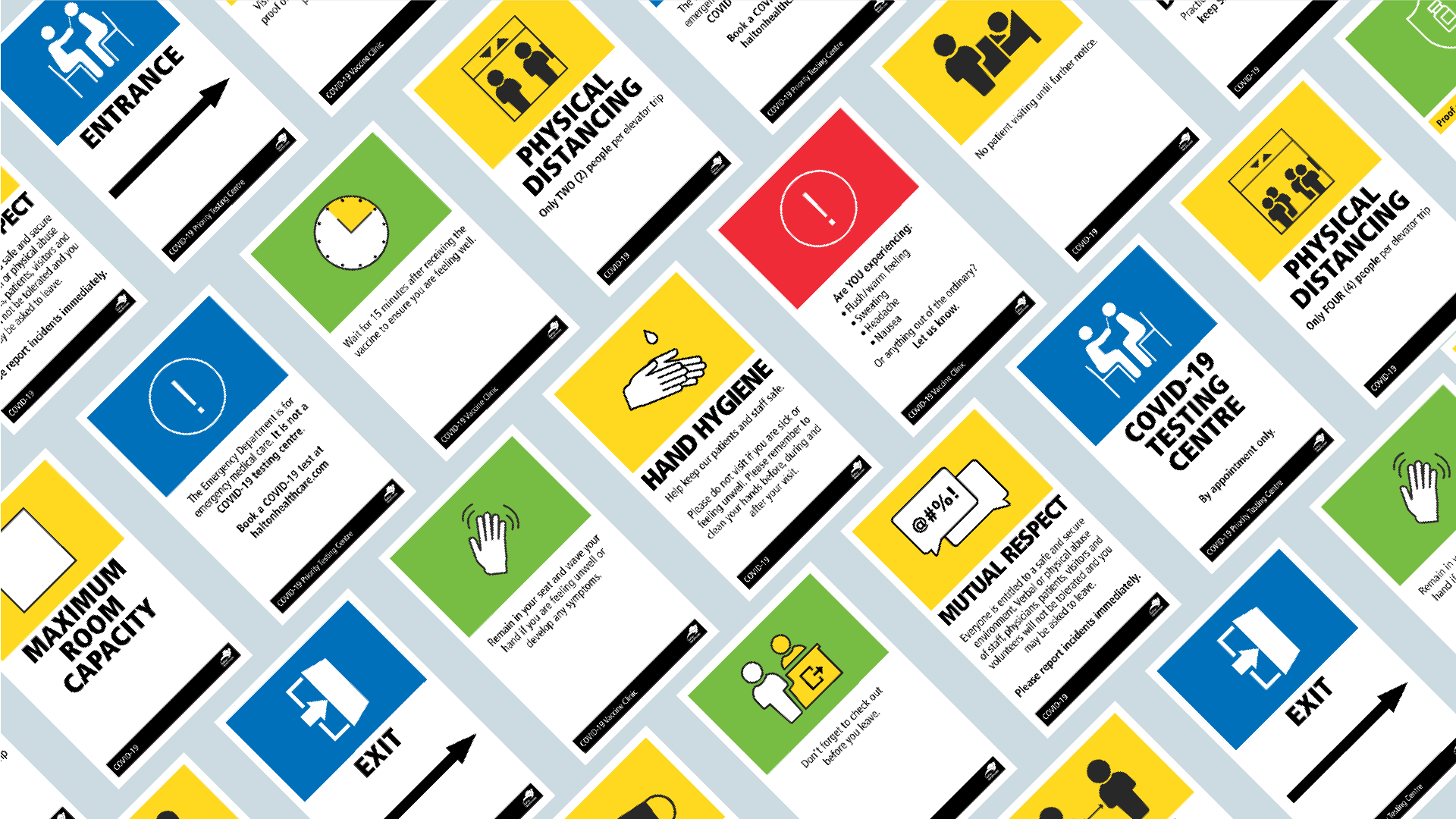
Signage
Utilizing a modular grid helped assimilate the content (text and icons) of the posters in an efficient, orderly and simplistic way. The spatial divisions allow the pieces to work with long and short texts.